Chartreuse & Ultramarine Blue nourishment
Experimenting with different color palette is fun part of process, but can also be quite challenging. Since I mix dyes to create various hues in silk, I feel as though pairing colors are not just about visual aesthetics or visual editing, but it's also about being in tune with the color itself. When I have made a prototype garment from the silk I've dyed, I usually like to take it out for a test drive. I wear it(or have someone wear it) for a day. I like to see how the look of the colors of the garment shift under different ambient lights, indoor or out. If I am wearing the prototype, I get the feeling of how the color "performs", meaning how it might effect my mood or my sense or well being.
When choosing certain colors to wear, we are often told one should wear certain color or pattern to compliment one's skin tone or body shape. I also would add it's also important to choose the color that makes you feel certain way.
One of my high school art teacher taught me that each color have its own "frequency", an invisible vibrating ray emitting from everything with color. Understanding that colors are more than what one perceive with eyes was an epiphany.
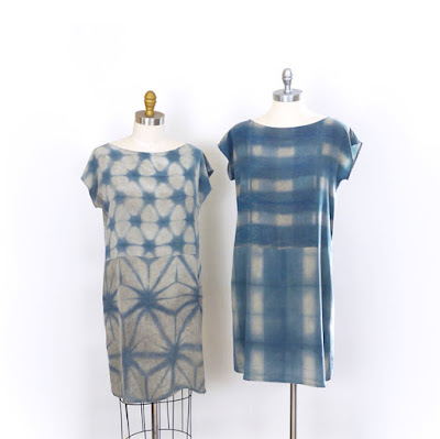
A few days ago, I had a visitor staying with me. I had her in one of my prototype and we went out for a breakfast at local bistro. It was a sunny and warm day, and I took some photos of her in my new creation. A passerby stopped us and complimented the garment. It was like a cherry on the top of a beautiful day!

When choosing certain colors to wear, we are often told one should wear certain color or pattern to compliment one's skin tone or body shape. I also would add it's also important to choose the color that makes you feel certain way.
One of my high school art teacher taught me that each color have its own "frequency", an invisible vibrating ray emitting from everything with color. Understanding that colors are more than what one perceive with eyes was an epiphany.
A few days ago, I had a visitor staying with me. I had her in one of my prototype and we went out for a breakfast at local bistro. It was a sunny and warm day, and I took some photos of her in my new creation. A passerby stopped us and complimented the garment. It was like a cherry on the top of a beautiful day!

 |
| Prototype garment at work! She's busy taking pics of pretty food. Like good food, a good color is a nourishment. |

Comments
Post a Comment